Sunday, 10 October 2010

Behind The Wheel

Be still
my heart.

Don't steal
my breath.

Be still.
Don't fall apart.

Like steel
- be cold and hard.

Don't feel.
Be told. Be smart.

Don't toy
with love.

Destroy
the one
you held
above.

Destroy
the man
I used 
to be...

No joy.
No fear.

Just me

Behind the wheel.

Thursday, 22 April 2010

Media Product - 'Beautiful Stranger', Variations of a Portrait

 Vangel Imre, Beautiful Stranger Variations


The subject of my Media product is the relationship between the original image of a person and the several drawn versions I produced from it. The 'Beautiful Stranger' series present three reproductions of a single photo through a different medium and done with different materials.What I find interesting about that is how each new image adds a new layer of meaning to the original by emphasizing on certain aspects of it and leaving out others. I started with a simple pencil drawing which highlights the main features of the model. After finishing that, I scanned it and digitally coloured it with a great deal of help from my brother. For the final third version of the portrait I took the pencil drawing and using an eraser and aqua colour pencils , reconstructed it creating a new coloured version. My idea was not only to examine the difference between drawing from life and using a photo of the model, but also to demonstrate the way we see and change nature as we try to imitate it in Art.

Developing My Media Product - Stage One


Vangel Imre, Beautiful Stranger v1.0


This is the first image I drew for the Media Product Project for the university's Visual Communication module. It is a portrait based on a photo of an attractive stranger I found in a social-networking site. I only used a normal HB pencil to sketch out the proportions of the facial features and finish the whole image.  This is a simple and honest attempt to capture the beauty of a person that I don't know almost anything about. 

And to quote Salvador Dali once more:

"Drawing
 is the honesty of the art. There is no possibility of cheating. It is either good or bad.”
I hope this is one of the good ones.

In Memoriam Keith Haring

"My contribution to the world is my ability to draw. I will draw as much as I can, for as many people as I can for as long as I can"
-Keith Haring (1958-1990)

I have found a lot of inspiration in the works of Keith Haring. He was an artists who truly lived for art.
I'm not sure why but looking at his art and reading about him, reminds me of that beautiful quote from Kerouac's 'On the Road' :


the only people for me are the mad ones, the ones who are mad to live, mad to talk, mad to be saved, desirous of everything at the same time, the ones who never yawn or say a commonplace thing, but burn, burn, burn like fabulous yellow roman candles exploding like spiders across the stars and in the middle you see the blue centerlight pop and everybody goes ‘Awww!


Haring's style was really something else. I was struck by his originality the first time I saw one of his works. His art is bold and simple, energetic and primitive, provocative, accessible, yet subject of many different interpretations.
Here's what his official web page says about his art:


By expressing universal concepts of birth, death, love, sex and war, using a primacy of line and directness of message, Haring was able to attract a wide audience and assure the accessibility and staying power of his imagery, which has become a universally recognised visual language of the 20th century.
I discovered this unique American artist only recently through a book by Alexandra Kolossa, from Taschen's artists series. A very well written and wonderfully illustrated book, here's what the author says about Keith Haring's style in the book's introduction:


Like almost no other artist, he understood how to combine his personality and his art into a single entity. His artistic trademark is the line, formally reduced to its essentials, which spreads out in many ways within the restricted area of the picture and takes proper account of its proportions. And it is always a continuous line, guided by the principle of chance, becoming an outline, then a figure and finally a symbol. Mostly the beholder needs just a brief glance in order to register what is to be seen and understood in his works. The particular fascination or Haring's art, however, lies in his ability to combine this strongly graphic style with a great deal of imagination...Spontaneity and assurance are the outstanding attributes of his work. Thousands wear his T-shirts; millions recognise his style. This was true when he dies, and it is still true today...He copied and integrated what he saw around him. Equipped with a sure instinct for the sensitive issues of his time,  Haring became a voyeur of American society and acted as a medium that every day absorbed and processed inspirations before disseminating them via artistic statements that he quite consciously geared to the spirit of his age.

Keith Haring, Untitled


May he rest in peace 

Wednesday, 14 April 2010

Happiness In Magazines


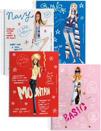
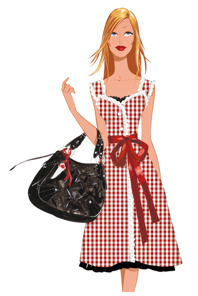
What impresses me about the work of Hispanic artist/illustrator Jordi Labanda is his precise and elegant use of colour and line. I am inspired by his talent for harmoniously merging ideas and aesthetics from fashion design, pop art, american retro culture and magazine stylistics, adding his personal touch and creating a recognisable new style.
A style driven by beauty as seen in the fashion magazines, his models wearing stylish clothes and trendy accessories, painted in pleasant warm tones and fresh bright colours with graceful long limbs and stylised features. Labanda's vision of the human figure is highly aesthetic as it is in active dialogue with fashion design - many of his images can be found on several collections of expensive stationary products and clothing accessories, magazines, websites, newspapers and even television adds.
Always smiling, wearing trendy clothes, looking flat yet beautiful, superficial yet idealised, the models in Labanda's images remind me of the happiness we see in magazines.

Tuesday, 13 April 2010

Michael Borremans

Michael Borremans, The Marvel, 2001


Belgian artist Michael Borremans has created a renowned body of work, acclaimed both for its mastery of the mediums of drawing and painting—and for the surreal and unsettling world he uses them to evoke.
All of Borremans’ work shares a sense of ambiguity and melancholy, with elements of the bizarre creeping into what at first seems like a technically startling, yet straightforward realism. Through imagery harkening back to an undatable past—though there are hints of the 1940s—Borremans creates an austere and oppressive world where things become more and more disturbing the deeper you look.
His second solo show at New York’s David Zwirner gallery shows Borremans working with a more contemporary mise-en-scene. In these new paintings, drawn from photographs the artist composed himself, Borremans turns to larger-scale formats as well as to exploring the genre of portraiture. In doing so, he also turns to the history of painting, through references to the style of masters like Goya, Velazquez and Chardin.

Here's a very interesting interview with the artist himself:
www.artinfo.com/news/story/13454/michael-borremans/

A Delightful Impression


Claude Monet is the founder of the Impressionist movement.
The contribution of Monet to art as a whole is immense. An inspired, original and prolific artist who defined a new direction for art in the 19th century, one opposing the rules and restrictions of Academic art, making way for a new way of seeing. And indeed he had a extraordinary gift for visual painting.
Cezanne supposedly said of him, "Monet is just an eye - but God, what an eye!"
 In my opinion the works of Monet ushered a new era in the development of art, one that is  not restricted in its attempts to imitate nature but demonstrates how different people experience and see reality and add new meaning and emotional nuances in their representations of it.

Monday, 12 April 2010

(E)merging Ideas


Here are some interesting extracts about the state of Art in the new millennium I read in the introduction of  Charlotte Mullins' book 'Painting People':
Figure painting is currently experiencing a major revival...Following modernism's demise after its long search for the perfect self-referential painting, in the form of the ultimate abstract canvas, Douglas Crimp asserted - in his inflammatory 1981 essay "The End of Painting" - that painting had martyred itself. In achieving its nihilistic aim, it had painted itself into a corner from which there could be no escape...But as Sabine Folie, one of the curators of the seminal 2002 figurative painting show 'Cher Pientre, Lieber Maler, Dear Painter' at the Centre Pompidou, Paris, has commented, artists did continue to paint.. In fact, painting an  was just biding its time until critical attention returned to find it in rude health.'
'Painting may have been for a short time somehow denied by an overexposure of video computer-art or photography' says Folie, 'but in the end, its methods of representation and transformation were enriched by all those media and not diminished.'..
There's no longer the sensibility that one genre should dominate contemporary art in its entirety, as was claimed for abstract expressionism in post war America. And there's no longer a sense of having to choose which style of work you exhibit... With the advent of postmodernism, which embraced diversity and multiple viewpoints, and represented a fracturing of stylistic hierarchies and a knowing sense of historical irony...As a result young artists rarely pin themselves down to one specific area of expertise...
Artists who paint are aware of the history of the medium, and references to paintings from all ages can be found in the work of many of the artists in this book. With  the prevalence of cheap colour printing, scanners and the internet, painting's history is laid out like a web in front of each artist...All artists, to some extent operate with  the knowledge that these vast stores of images are available at the click of a mouse.

I would only add that the diversity of viewpoints and inter-textuality that are typical of Postmodern art  create a unique form of dialogue between different artists, genres and styles, transcending time and space. In my view these types of cultural bridges, spanning through different periods and continents only enrich art and make it more interesting. And to support this statement, here's a quote from the Spanish surrealist Salvador Dali:

"Those who do not want to imitate anything, produce nothing."
     Salvador Dali

By imitating not only do we learn from the original and pay our homage to it, but we also develop its ideas and add something new which is ours, and that's what makes what we've created to a certain extent new and unique.

Sunday, 11 April 2010

Contemplating on Style

Art is the visual history of the world.
Throughout history people have  witnessed many shifts in style and  form.
But can each style in Art be seen as a vessel for the aesthetic, social and philosophical concepts of the time it was conceived in?
Or can Art stand on its own and against the winds of change, timeless and untouchable?
Can we really speak of  "l'art pour l'art"?

The style  of an artist is his way of seeing and depicting the world that surrounds him but also his own reflection of it, or the world in his eyes, influenced by his emotions and world views. Therefore the work of art is not merely an imitation of a real object, but a new version of the object with additional nuances of meaning and emotion brought about by the artist's personality. The "mimesis" is not pure.
"Art is the imagination expressed through the senses"

The artistic style is the set of aesthetic criteria through which an artist chooses to evaluate his or her work.
This set of ideas about beauty tell the viewer about the artist's theory of art or what he or she believe is its purpouse.
I would argue  that the artistic style is a type of ideology in the sense that it covers most the main views and ideas on the relationship between man and nature, man and society, psychology and philosophy and etc.

These are all encoded through the visual language (style) the artist uses to express his or herself.

Saturday, 10 April 2010

Mirror - Mirror ...

Vangel Imre, Floating Head in Bright Colour
This is my attempt at a self-portrait. It is loosely based on picture I took of myself for a Photography assignment, which you can see here:
Vangel's Picasa Web Albums - Self-portrait Photo
At first it was only a realistic pencil drawing I did as a sketching exercise, but since I wasn't happy with the result  in terms of proportions I decided to leave it and not invest more time in it.
Some weeks after as I felt an inspiration to draw again I decided to finish this image by applying some changes to alter the mood - redoing the lines and 
guided by intuition, observing how different colours correspond with each other. I tend to ask friends about their opinion before posting my work here.
One opinion that stood out from the rest for this image is that it is in a way reminiscent to a painting in the style of the Impressionists,  the difference being the materials used.
I wasn't really aiming for that, but I have always been inspired by the way artists like Monet, Gaugin and Seurat were treating colour and light in their paintings. I don't believe that I've accomplished anything like that here, apart from the loose strokes  and the interesting combination of colours.
I might have subconsciously been influenced by the examples in a book about Post-Impressionism that I was reading at the time. 
In any case this is an interesting image to look at in its own right.

Friday, 9 April 2010

Constructing Meaning

 Vangel Imre,Neon Saint


How this image came to being:
- I was looking at fine examples of portrait photography either for inspiration or for direct reference and drawing. I stumbled on a very interesting image called
"Rock Face" by John Swannell. The author used a nude female model and inspired by surrealist Rene' Magritte's "Son of Man" produced a nude study with a rock covering his model's face.  The image was by itself very interesting and aesthetically pleasing as  the emphasis is on the model's figure which is universally harmonious. As I was thinking of a possible way to work with this image I placed a thin white sheet of paper on the picture and started tracing the  nude silhouette with  pencil. At this point I decided to explore the ways colour could suggest meaning. I wanted to use only a few bright tones and work with materials that allowed me more control over the lines. For that purpose I chose felt tip pens. I picked blue for the silhouette itself because I associated the colour with water, an element I believe suitable to represent female nature. At first I coloured the central parts of the silhouette roughly, with loose strokes, leaving a lot of white areas surrounding them. The result reminded me of vapour, but it somehow looked unfinished, so I coloured the white spaces.
The outer line of the silhouette is done in green which I felt would correspond well with the  yellow I used for the energy field surrounding the figure, which I later developed into a halo around her head to add religious subtext to the image.
At this point it was only the female silhouette with the energy field/halo surrounding it against white background. I thought of  adding geometrical beam-like lines coming from the central image, but left this idea for a better, more efficient and interesting solution.  I chose to place the figure using collage in what I found a contrasting environment-  a newspaper text-only page, which is a part of our everyday lives and culture. In my view this combination not only made the silhouette stand out even more, but added some more subtext to the image. I still had the problem of the eye being  distracted by the background text, so I found a solution by adding vertical parallel orange lines surrounding the image, which I believe direct the viewer's eye. And to give it a more finished look I drew a frame, again in orange and left my initials in my native language, at the top right-hand corner- that's the way I sing my drawings.
Some possible interpretations:
As I was making this drawing, several ideas on how to name it came to mind:
- the rather descriptive and a bit misleading "Androgynous Silhouette in Blue"guiding the viewer to think of the figure as a sexless being (I believe in Orthodox Christianity some types of angels are considered androgynous) ;
- "Modern Day Miracle", which could be derived from the contrast between the energy lit figure and the common newspaper background;
- "Inner Strength", a name suggested by a friend, because of the aura-like feel the use of colour gives it;

 and the final name I chose "Neon Saint", suggests this image is a modern interpretation of an icon.
Icons are popular in Eastern Europe.


"They are literally an image of Christ or a Saint. They are stylised and tend to look similar, the reason being, that the artist making them was thought to be expressing God's vision rather than a worldly one.The icon was seen not as a man-made image but rather as a divine one.Therefore, any trace of artistic personality was though to be bad"


(Art Theory for Beginners, Zidane Press, London,2006,p24).
I chose this name because I found some compositional similarities between the image I produced and actual icons. Neon is something associated with the superficial in modern life. It is a type of light invented by man. Which reminds me of the Atheist statement  "God did not create man - man created God" So this image may be viewed as a statement on Religion today.
 It may also be seen as a comment on modern celebrity-based culture- stars appear in the news-papers and are worshiped and followed by millions.

Thursday, 8 April 2010

When the Normal Becomes Disturbing

James RiellyIn Mind, 2003
This in my opinion  is a very powerful and memorable image.
It definitely stood out from most of the modern examples of portraiture which I have found in Charlotte Mullins'
"Painting People".
What strikes me about it is that the artist has achieved maximum effect with almost  minimum use of colour and compositional devices. This type of efficiency is something I strive for in my own images.
It was no surprise to find that most of Rielly's images, including this one are based on photographs. All of his paintings I've seen so far seem cold, still and lifeless, void of emotion. And in all of them the subject of his attention are kids. In our natural and cultural understandings, children represent purity and innocence. We think of them as vulnerable and harmless.
Rielly seems to play with this notion by de-contextualising his subjects. At a first glance everything seems normal. But if you look at some of the details, you are left with an odd feeling. This bizarre interpretation of the child-image also reminds me of  Diane Arbus' famous photograph "Child With Toy Hand-Grenade in Central Park".
I find Rielly's stylistic approach very simple, yet interesting. The artist is very abstemious in his use of colour, there are no superfluous nuances. Each of the images I have examined is painted only in four or five colours. I consider the lifeless look of his images, a deliberate demonstration of his aesthetic position.

The image I've posted here is the one I liked the most. It summons up all of my observations.
The disturbing effect comes from the way the eyes of the boy stand out from the rest of the image, as well as the fact that the Mikey Mouse ears are attached to a racing driver's balaclava.

"Rielly's paintings have always had an uncanny ability to unsettle the viewer...Rielly uses photographs from tabloids, magazines and forensic books as the starting point for his disturbing paintings, removing the context of the image so that what may once seemed acceptable now becomes bizarre, surreal. His style heightens each work's strange effect - faces bleached of colour, like over-exposed photographs, except for the eyes which pierce the viewer with their intensity, unnervingly holding you gaze even as you turn to walk away."
(Painting People:The State of the Art, Thames and Hudson Ltd, London, 2006, p66)

Wednesday, 7 April 2010

Bringing Colour to the Monotonous

 Vangel Imre, Everyday routine
For this drawing I decided to depict a part of my brother's everyday routine - browsing the web, in this case on my netbook. Since this is a very long and uneventful process for the observer (I was in fact waiting for my turn to check my email) I decided to use bright colours and stick to a cartoon-style portrait to make it more interesting.
I like it in terms of composition because it is a little unconventional if we decide to classify it as a portrait.
In my view the emphasis here is on the objects (desk, chair, pc, and the shoe in the bottom right hand corner, which is a nice detail), the figure is in a way depicted as one of them. My explanation for this effect is the angle I chose to draw my brother from - behind his back. In this way  not only does he remain anonymous but he also becomes a collective image of a person doing a habitual action. A sign expressing the mundane, if you will.
The viewer doesn't see his face and eyes, so this could be anyone in front of a netbook on a desk.The only thing suggesting some hints for the personality or the emotional statе of the sitter is his pose.
Having chosen very bright colours  which are in contrast with  the rather plain subject of the image, I believe I have managed to convey a certain mood of warmth and comfort. The flatness of the image makes it look disarmingly unpretentious.
The sitter's garment is in cold tones which make it stand out from the warm colours of the rest of the picture. These cold tones of blue may  lead the viewer to the impression that the sitter is static or  lacking energy, which along with his pose expresses his physically passive, contemplative state of mind.
A large portion of the image is deliberately left blank, to contribute to the fleeting-impression-like feel.
I see this drawing as a quickly sketched out impression of a small everyday event. There is something whimsical and quirky about it, which I find very charming.

Tuesday, 6 April 2010

Voltaire and I

This is an image taken from my first Visual Diary.
I find it to be one of my most successful recent  drawings.
It is based on a portrait of  the French Enlightenment philosopher by Catherine Lusurier (1753-1781)


Vangel Imre, 
Voltaire

Sunday, 4 April 2010

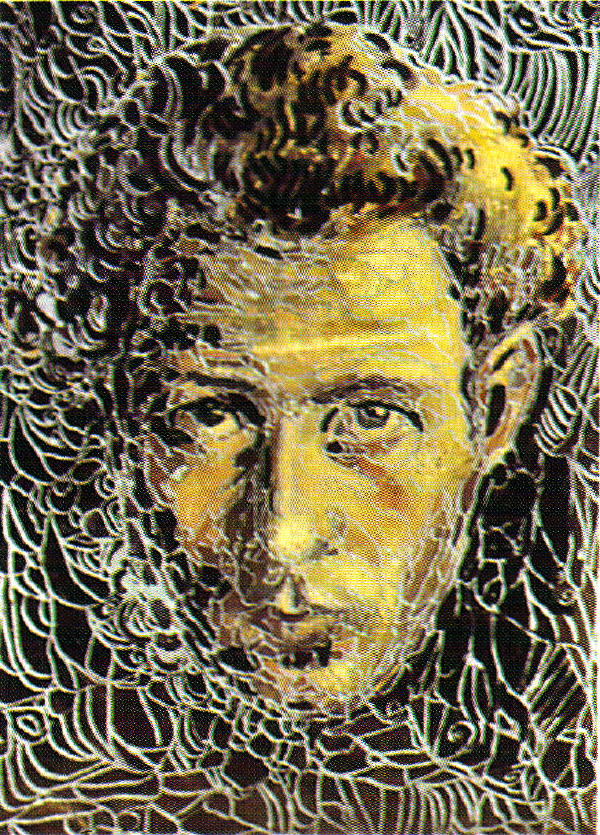
Adriana Czernin, Gustav Klimt and Ivan Milev


Adriana Czernin, Untitled


Adriana Czernin is a successful Bulgarian artist living in Vienna since 1990. Many art critics compare her to Gustav Klimt and the tradition of Jugendstil (http://www.answers.com/topic/jugendstil)
When asked by a reporter for an art magazine in Bulgaria weather she wanted to find a place in this Austrian Art Nouveau she denied being directly influenced by Klimt. Czernin explained that she in fact found inspiration in the works of Ivan Milev, a Bulgarian artist who created his own original interpretation of Jugendstil, combining it with the local folk art and icon painting.
Here is what Czernin says about the influence Milev had on her work:
"I had a book with reproductions of his work, and I looked at it for a very long time. I was fascinated with the decorative, the flatness of shapes, by the situation of figures and their surroundings in which the foreground and the background begin to change their places and roles. When I later discover Klimt in Vienna, it seemed to me that there was more power in the style of Ivan Milev, more tragedy, as if Klimt's style was more decorative."(Capital)


Ivan Milev, Self-portrait
.


RHCP - My Friends


Anton Corbijn was the director of this music video for the RHCP's single "My Friends" from the album that came after their breakthrough  "Blood, Sugar, Sex, Magic".
At the beginning of his career as a director, Corbijn was better known for his photography than his video work, having served as house photographer for prominent bands ranging from U2 to Depeche Mode, to Joy Division.
Corbijn favours the texture and grain black-and-white stock for most of his videos, and when shooting in colour, often depends on an overprocessed, supersaturated stock that makes individual colours pop off the screen...Corbijn is expert at emphasizing the mythic qualities of his clients, with videos like Red Hot Chili Peppers' "My Friends" (1995), U2's "Electrical Storm" (2002) and Echo & The Bunnymen's  "Lips Like Sugar" (1987) accentuating on the larger-than-life mystiques of his clients.
(Money for Nothing: A History of the Music Video from the Beatles to the White Stripes, Continiuum, 2007, p113-114)

Saturday, 3 April 2010

The Bold and the Beautiful

Bewegungsstudie by Rudolf Koppitz


I first saw this image  some months ago, on a photo-collage wall at the Media Museum in Bradford, and it immediately struck me with its elegant use of the human figure, natural flow and sensuality of its aesthetic.
It was only two weeks ago when I was doing some research for this blog, that I learned what the image is called and who produced it. To my pleasant surprise it was waiting for me between the pages of a book I borrowed from the library. This is what the author of the book, Terry Hope writes about this iconic photograph:

In Austria in the years between the world wars, Rudolf Koppitz was one of the primary movers in the photographic art scene, and "Movement Study" produced in 1926, is his finest work. The composition is immaculate, and has led to the picture being declared one of the greatest images of the 20th century. The gentle tilt of the heads of the models in the  background contrast strikingly with the graceful sweep of the nude in front. Her body is framed entirely by their costumes, and the flow of the picture , created by the dynamic shapes moving at odds within it, ensures that the image is brimming with astonishing vitality and life. When one looks at the degree of control the models have of their bodies here, and the grace with which they're posing, it's perhaps little surprise to learn that all  four were Russian dancers.

The picture resulted from Koppitz's determination to push back the boundaries of what was acceptable in terms of  perspective and the use of symbolism, and his contemporaries often saw the naked figure in the picture as representing death, although Koppitz himself never added any subtitle. Whatever the interpretation, the picture certainly succeeded in changing the perception photographers had until that time of the ability to show movement in a still picture and, as such, it freed up ideas about composition and posing and still has much to teach the photographer today.

(Portraits: Developing Style in Creative Photography,Black and White Photography,Rotovision SA, 2000, p25)

For some more information on the work and life of Rudolf Koppitz follow this link:
http://en.wikipedia.org/wiki/Rudolf_Koppitz

Lost in Translation


Mind at Peace


The salt of our numbered days
on the dry tongue of the time that's passed .
And it's true that time heals all wounds -
all pain is healthy in small doses.
Life is pain and each day is a small dose.


Покой


Солта на дните преброени
по сухия език на отминалото време.
И вярно е че всички рани то лекува.
На малки дози всяка болка е полезна.
Болка е животът и малка доза всеки ден е.


"Poetry is what gets lost in translation"


                                                                - Robert Frost

Friday, 2 April 2010

Mysterious Ways

Can this masterpiece of portraiture be viewed as
Vermeer 's version of the Original Sin?

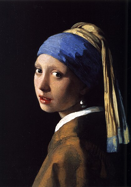
In this entry I shall try to unveil part of the mystery behind "Girl with a Pearl Earring"


This is one of the key paintings of the 17th century Dutch artist Johannes Vermeer.
It is often referred to as the "Mona Lisa of the North" perhaps because it "resists all attempts at the precise identification of the sitter" and as its famous Italian sister it can be seen as "an evocative expression of timeless female beauty".(
ArtBook: Vermeer, Dorling Kindsley Limited, 1999)


The name of this painting is "Girl With a Pearl Earring". I think the artist doesn't identify the sitter in the title with a purpouse.
I have a lot of thoughts about this image, but I don't know where to start from.
There's a whole novel based on this very painting , which was adopted into a film and then into a play. I've seen and liked the film But before I tell you what the film says about the painting and, let us look at the art piece itself.
I don't know about you, but it leaves me with a feeling of something intimate and fleeting, a stolen moment. This may be attributed to the indefinable mood of the girl, her gaze speaks of not one but several emotions, merging together, something a little bit more complicated and difficult to read.
I see melancholy, a little a bit of fear, and a sort of expectation in her gaze. The sense of expectation heightened by her gently semi-opened mouth.
Composition-wise this a very simple and straightforward painting. We see the female figure looking over her shoulder, her face in semi-profile, with same free space left in the right-hand side of the canvas, so it can 'breathe', this also guides the viewer's eye to certain areas of the portrait. This is accomplished with the use of some of the techniques we studied for the Visual Communication module.
I believe the artist chose black for the background, so that the pale skin of the model would stand out more and to let the viewer's eye focus only on the figure itself, not burdening our attention with
extra detail. The emphasis here is on the sitter, her face.
The black background also conceals even more the story of the depicted person. It heightens the sense of mystery to this portrait. Usually in portraiture artists tell as the story of their sitter through the use of props – the depicted person's garment, the objects that surround him or the background environment.
Here the accent is place only on the earring.
Vermeer, the creator of this painting was considered to be a master of light and composition.
But "Girl with a Pearl Earring" is not a good example for sophisticated composition. To me it serves more as an example how an artist can accomplish maximum effect with a minimum resorts.
Now if we look at the girl's clothes we see nothing extravagant or expensive, giving away noble descent, although she is beautiful and she has gentle features.
And to answer the question, who or what she is looking at – I believe she's looking at the artist himself. It is a logical and simple answer... but I believe that this painting has printed the relationship between Vermeer and his mysterious sitter into history, all summed up in one discrete and emotionally charged expression on her face.
Now to tell you about the conclusion to which the writer of the novel based on this painting has come. This is merely a speculation, because there aren't many known facts about Vermeer's life and none what so ever about the identity of the sitter.
According to the film/novel this is one of Vermeer's servants, with whom he had an affair, and if my memory serves me right, she even carried their illegal child. She is not a professional model and that's the reason the painting has a more natural feel to it,
unadulterated and genuine. The girl is not posing for the painter, she is her true self. The little hint in the title of this image – the earring, is an expensive piece of jewelery belonging to Vermeer's wife, which he asked the girl to try on so he can paint her wearing it. In order to store that image of her for eternity.
A very beautiful gesture, in my opinion. This theory explains the subtle fear you can read in her eyes – she is scared because she's doing something forbidden.
I think Vermeer's painting can be seen as an interesting interpretation of the biblical story about the forbidden fruit, realised through the means of painting, and in this case the pearl earring is a symbol which connotes to the Original Sin.

Tuesday, 30 March 2010

A Portrait of the Blogger as a Young Man


This is a portrait of myself, taken by a friend of mine who studies photography as a hobby.
It is my favourite photographic representation of myself so far, and one I use for my profiles in social networks.
This is a very interesting image in terms of composition. Although the focus and therefore the emphasis is on the figure, the key to understanding the story behind the photo is the detail in the foreground - the pairs of sunglasses.
The photographer actually took a picture of my reflection in the mirror of a sunglasses stand as I was trying on different pairs. You can see from my expression that these are the ones that I liked the most.
In terms of lightening this is a very bright image - warm colours and light, which contribute to the feel-good feeling of the photo. The background is subtle in its lack of detail, slightly overexposed to the light.  This makes the figure stand out even more, as if in a pool of light. Indeed it was taken on a very sunny noon.
What I like the most about this photo is the way its meaning can be interpreted.
In popular culture today sunglasses are often associated to stars  - actors, musicians, artists.
Using the terms of semiotics, sunglasses are the signifier  and celebrity attitude is the signified. In my opinion the relationship between the signifier and signified is arbitrary -  the purpose of sunglasses is merely to protect one's eyes from the sun, hence there is no natural link or relationship between form and content.
I see a subtle joke or irony in this image. I, the model, seem to be striving to look like a celebrity, but in fact I am just trying out a certain look out of curiosity.
And in the context of the image the sunglasses can act as a mask , one that I put on to obtain star-like qualities, but also a mask that hides my eyes, and  thus my soul or true self.
And to conclude, I have chosen this photo to represent me in social networks, because of its dual meaning - on one level in it I am trying to present myself as a popular figure, and on an other I keep my personality hidden.

Monday, 29 March 2010

Setting Forth

"Art changes people, people change the world"
                                       John Butler


Art is man's greatest invention.
Art has the power to change people's minds, inspire and provoke.
A piece of art can store vast amounts of information about the historical, socio-political and cultural context it was created in.
Through Art, artists  are able to create new artificial realities existing in parallel with the one we live in .
Artists were  once considered prophetic figures, spiritual leaders and even embodiments of God.

This Blog is going to be about my fascination with Art.
In it I plan to study what inspires me.
It is going to be a journey towards deeper knowledge and understanding of Art,
acquired through intuition, research and reasoning.

"From the fool’s gold mouthpiece the hollow horn
Plays wasted words, proves to warn
That he not busy being born is busy dying.
"
                                     Bob Dylan
I have chosen "Busy Being Born" as a title for this blog, as a manifest of my will to be active, creative and full of zeal.
To continue my search for self-expression and self-reinvention.

And finally this Blog has come to being thanks to my tutors at the University of Bradford who have stimulated and encouraged me to start it and through their lectures provided the basis for my further research.

Thank you!

Let our journey begin!

"Ars longa,

vita brevis,

occasio praeceps..."


           Hippocrates